Concept and art direction of the LOD Platform Entity Discovery Portal
The LOD Platform Entity Discovery Portal has been designed in a joint effort of the Share Family staff and member institutions, to respond to both patrons and library staff requirements and expectations, to reflect the components of the underlying BIBFRAME-based data model infrastructure, and to provide an intuitive user experience.
It is designed to be easy to navigate. The structure and design of the system encourages browsing and exploring. The interface makes it quick and easy to jump from entity to entity until the user finds what they are interested in exploring.
For more details and visual representations, consult the LOD Platform Entity Discovery Portal UX guide, describing the concept, functions and components of the Entity Discovery Portal and its user experience.
Start anywhere — explore from there
The user interface consists of two primary kinds of pages:
1. Search pages
Search pages let users search for content and filter down results until they find something they want to explore in more detail.
2. Entity pages
Entity pages make up the bulk of the Entity Discovery product. Whenever a user clicks a search result, they will find themselves on an entity page. A user can also find themselves on an entity page by following a URL (the entity URI) presented by an external site (eg. a search engine result) or held in an external dataset (eg. References to entries in a shared dataset of another library, Wikidata, etc.).
Entities can have different types, such as Agent, Work, Subject (including Topic, Place and Event) or Publication (which is a logical grouping of BIBFRAME Work and BIBFRAME Instance properties, for providing a better understanding to end users). The system makes it easy to navigate between entity pages because the design of each entity page has been built around presenting all related content in an easy-to-use manner. This means that the user can, through the Simple Search or Advanced Search functions, open up an entity anywhere in the data grid and, from there, jump to parent, children or sibling nodes in the grid.
In addition to providing user display and interaction, an entity page will deliver machine readable capabilities. These are of two types:
- Embedded structured data. Each page will have embedded within its HTML markup a structured data description of the entity it represents. The description will consist of one or more JSON-LD encoded tags using the Schema.org vocabulary. This data will be utilised by search engines and others to provide enhanced listings and links, etc. This means that these collections will be more readily discoverable via popular search engines such as Google when users are seeking relevant information.
- Linked Open Data provision. Following Linked Open Data and web content negotiation principles, requests to the entity URI requesting RDF specific data formats such as (RDF-XML, Turtle, Triples, Quads, JSON-LD) will receive data in that form instead of HTML.
Direct connections
Each entity page lists its directly connected entities. These are defined as certain entity types with a certain relationship to the entity in question. Whenever these entities exist, an exhaustive list of them will be available from the entity page. These might be e.g. on a Work page lists of: Agents who created this work; Agents who are subjects of this work; Instances (Publications) of this work, etc.
Indirect connections
In addition to listing exhaustive lists of related entities, the interface will often also show links to indirectly linked entities in the UI. These can be shown as exhaustive lists or individual links. Examples of this are: A list of “Related Subjects” on an Agent page, listing the Subjects of the Works of that agent; or a link to the creator Agent of the Work, on the page of an Item (these are not directly linked, but they are conceptually related because of the hierarchical relationship between Work and Instance).
Breadcrumb links
In addition to direct and indirect links, the breadcrumb bar appears in the UI on certain entities to visualize the conceptual or perceived hierarchy between Agents › Works › Instances › Items. The breadcrumb makes it easy to quickly move up this conceptual hierarchy to the conceptual parent or grandparent entity (e.g. moving from an Instance to the creator Agent of the Work).
Filtering
On each entity page, as well as on search results pages, filters are shown to make it easy to narrow down the data at hand.
Art direction principles
The art direction of is focused on two things: making linked data easy to understand and easy to use for library users. While maintaining simplicity in the UI, we guide the user through the complex data grid underlying the system.
In addition to keeping the UI simple, we have prioritized the following:
1. Conceptual data presentation
In general, we represent the entities in the UI in a way this intuitively makes sense. I.e. even if a certain piece of metadata technically belongs on the Item level, we may show it where relevant on the Instance level (e.g. physical location).
2. Conceptual hierarchies
We represent conceptual hierarchies in the UI where relevant (e.g. in the breadcrumb or in the choice of metadata).
3. Encouraging exploration
We designed the interface to encourage users to jump from one entity to another, encouraging exploration and discovery rather than only searching for known items. We believe this is a good way to create a new kind of experience and to make use of the nature of the linked data grid.
4. Accessible layout
We design the system to be usable and accessible. This includes supporting:
- Input sources
- Keyboard navigation and shortcuts
- Mouse and trackpad
- Touch screens
- Screen readers
- Color themes, e.g. Dark theme
Configuration options
This document presents the options available for configuring the Entity Discovery Portal part of the LOD Platform technology supporting the Share Family environments.
The configuration options of the Share Family discovery portals are designed to enhance the experience of end users navigating the linked data descriptions of the resources displayed, and are already applied to https://svde.org, https://pcc-lod.org, https://natbib-lod.org.
This solution applies to both individual institutions, consortia or networks of institutions, and has been developed not only for general exploration purposes, but also to connect end users to local libraries’ / consortia services directly from the discovery portal of the Share Family environment. Therefore, the Entity Discovery Portal can be configured at several layers: for individual institutions, for a single consortium / group of institution, for a network of consortia.
This process allows to seamlessly integrate the advanced linked data layer offered by the Share Family with the local library activities, and is independent of the ILS / LSP used by the institution.
The configuration options described in this document refer to:
- discovery portals structure;
- branding and design;
- textual content;
- some specific functions.
While this document presents the particular configurations of the discovery portals, the default functions of Share Family portals for exploring and for collaboratively editing the linked data exposed are extensively described in these guides (referenced at https://wiki.share-vde.org/wiki/ShareDoc:PublicDocumentation/User_guides):
Terminology and structure of Discovery Portals
Depending on the needs and scope of the institutions joining the Share Family, different scenarios apply in terms of configuration of the entity discovery portal that end users (both patrons and professionals) access via public user interface to explore the underlying linked data resources.
Discovery Portal
Every Share Family website is referred to as a “discovery portal” or “portal”.
Portal group
Every portal is a part of one “Portal group”. Portals are grouped around a shared database. For example: https://svde.org is a portal group collecting the data of several institutions members of Share-VDE initiative.
While the portal group shows the data of all the institutions feeding the database, the institutional portal gives the ability to filter only the data of the institution that it has been designed for (see below).
The portal URL can be configured and it will also be the base URI, ie. the prefix of URIs created by the system to uniquely identify its entities. For example: the Share-VDE portal base URI is https://svde.org.
Primary and secondary portal
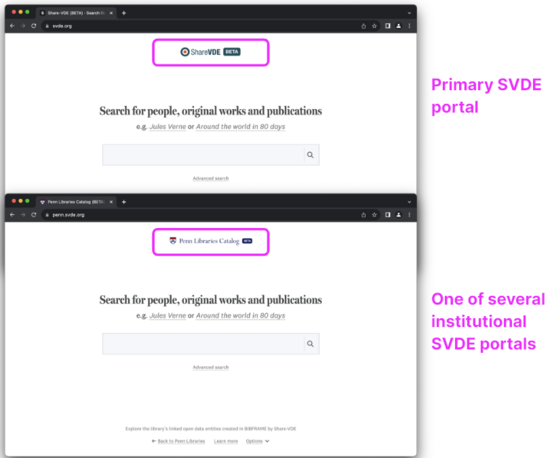
Each portal group has one “primary” portal. This is the non-branded version of the portal that represents the project as a whole, and not a particular institution or variation of the website. All other portals in a group are “secondary” or institutional portals (also informally called “skin portals” in Share Family jargon). The primary portal has certain minor differences compared to secondary portals. “Secondary” is the term used to configure features in the back-office, and in this context is synonym of “institutional”.
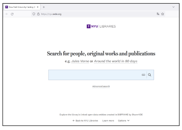
For example: the primary portal of Share-VDE portal group is https://svde.org; institutional secondary portals are available for member institutions, eg. https://nyu.svde.org.
Single-portal portal groups
If your portal is the only portal of its kind, it will still belong to a portal group, only the portal group will consist of a single portal. For example: the PCC portal https://pcc-lod.org/ hosts a single database, that is the PCC data pool (ie. the open pool of PCC-quality BIBFRAME data housed by the Share Family initiative).
Portal group configuration
Branding and design
The branding of the primary portal (logo, header colour) is selected by the consortium / group of participating institutions. If consortium members / participating institutions have their own, branded version of the portal, the primary portal typically has the consortial branding.
Text content
The portal has default texts in some areas, but those can be configured.
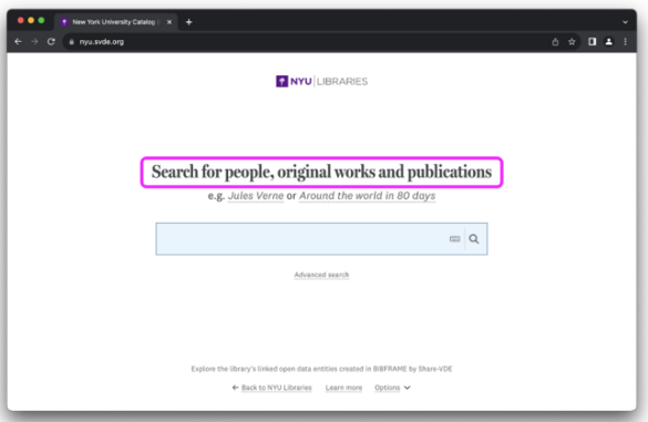
Frontpage headline
The default headline is a phrase indicating the main entities that can be searched: people (ie. contributors), original works (ie. the title of the resource in its most abstract sense), publications (ie. a publication of a work).
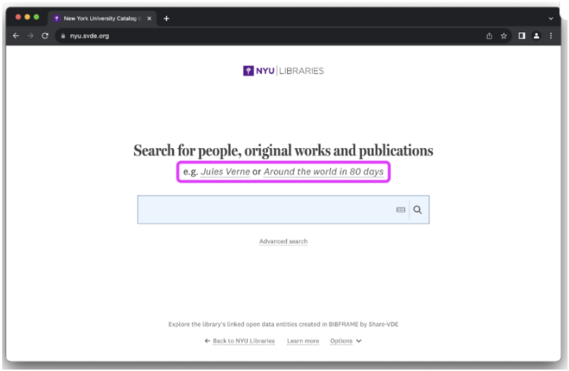
Frontpage search examples
The frontpage search examples give the user an idea of something they might search for. Clicking on these texts triggers a search. These examples should be:
- exemplifying different types of entities (e.g. original works, agents or concepts);
- instantly comprehensible to visitors (i.e. use names and titles that are commonly known to your audience).
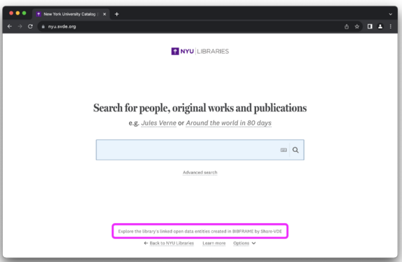
Frontpage footer text
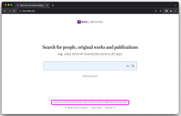
Provide a text that is one single sentence, very short, and summarizes in non-technical terms why this website is relevant for the visitor.
Subpage footer text
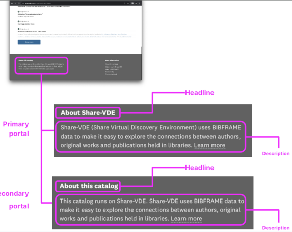
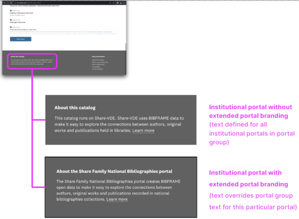
On all subpages, a separate footer text appears which is slightly longer than the footer text on the front page. This text consists of two parts: Headline and Description (see illustration)For multi-portal groups, the footer text comes in two variations: one that is used on the primary portal and others that are used on all others (i.e. institutional/secondary) portals. The purpose of this distinction is, in the cases where it is relevant, to have a general project description on the primary portal, while on institutional portals, to be able to refer to the main portal as the representation of the underlying infrastructure — e.g. the main SVDE portal being referred to from all other SVDE portals (see illustration).
Links to alternative search sites (optional)
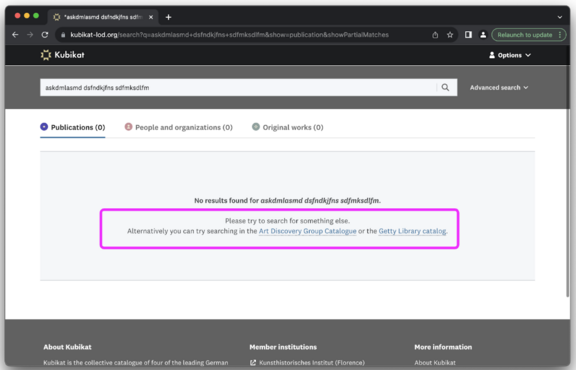
If you have alternative search engines that may be relevant to visit, you can provide links to these when no results are found via the portal group.
Placeholder text (optional)
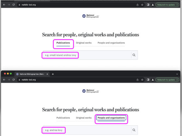
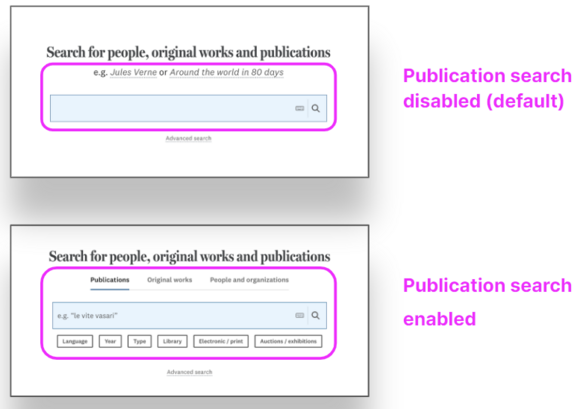
If you have enabled ‘publication simple search’ (see below), you may want to select ‘placeholder’ texts with search examples for the search input fields, since the ‘publication simple search’ layout means that the subtitle with examples is hidden on the frontpage.
Information pages
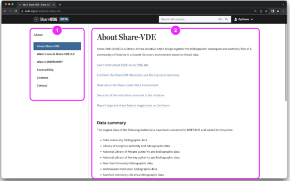
The information pages consist of two main sections:
- navigation: it contains a list of links to various informational pages. Clicking on a link opens up that page.
- Page content: it consists of a headline followed by a longer description on the topic of the given page.
As example, see Share-VDE information pages https://www.svde.org/about/about-share-vde.
Functionalities
Some functions of the discovery portals can be configured.
Search type
The simple search logic can be customised.
Default simple search
Among the available customisations, you can decide to show a ‘publication search’ as the default search type in the portal. If this setting is enabled, the searches for agents and original works are still available on their own, but the ‘all results’ tab in simple search will be replaced by a ‘publication results’ tab.
An example of the publication search can be found at https://natbib-lod.org, as opposed to the default simple search available at https://svde.org.
Home page filters
Optionally, a series of filters can also be defined to make available on the frontpage, that users can apply from the beginning of their search. Note that, because the frontpage search will represent every single result in the system, the filter options on the front page are not facets, but pre-filters, for which it is possible for users to define a combination with 0 results.
These ‘pre-search publication filters’ are applied before a search is performed at all, and thus cannot be progressively updated.
Identifiers
Identifiers are another typical example of data that can be configured to be made available for search. Standard identifiers indexed by the system (eg. ISBN, Wikidata ID etc.) can be included among those that can be searched; identifiers specific to a particular use case / institution that provides such IDs in their records (eg. the BNB - British National Bibliography Number) can be configured as well.
Partial matches
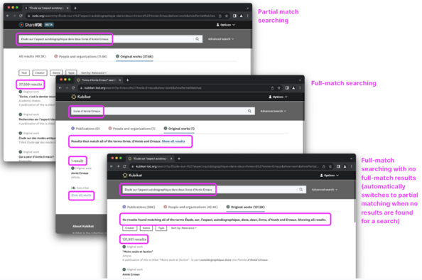
For simple search, you can decide if the default behavior should be one of searching for every term (aka full matches) or any term (aka partial matches).
Partial matches
If you choose to display ‘partial matches’ in simple search, the system will aim for always getting results, even if they do not contain every single word the user has entered.
Full matches
If you choose to only display ‘full matches’, the system will more often show a ‘no results’ page, but when there are results, they will always match every word the user has entered.
In a full-match search, the user is offered the option to expand the individual search to include partial matches; and if no full-match results are found for an individual search, the system will automatically re-submit the search to find partial matches and display those.
Enable ‘Quick items’ feature
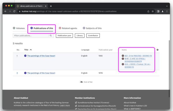
For some libraries, the focus may be to get the users directed to a physical location in the library as fast as possible. For these cases, it is possible to enable ‘quick items’ — a feature that shows item data directly in lists of publications, saving the user clicks when looking for a physical location. This option might be meaningful to enable together with the ‘publication simple search’ feature for some libraries.
Display of subject provenance
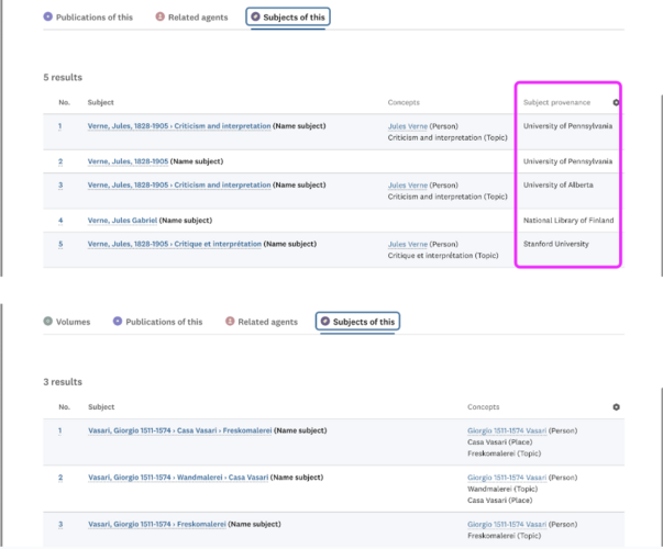
In case of data coming from a database shared by multiple institutions, showing the provenance is relevant as it gives evidence to the subjects contributed by the various institutions.
Decide how to sort entities on entity page
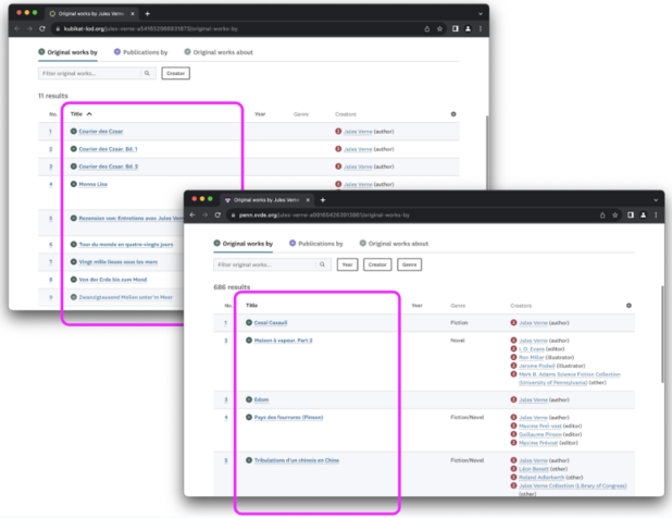
If this feature is enabled, entities in tabs on an entity page, will be sorted alphabetically. When it is disabled, entities will be sorted by relevance.
The example on the left shows a list of entities with alphabetic sorting enabled by default. The example on the right shows a list of entities with alphabetic sorting disabled by default.
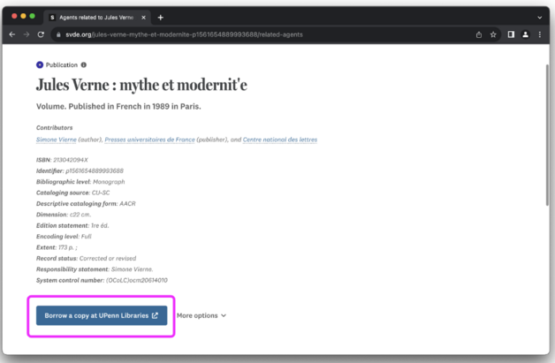
Action button
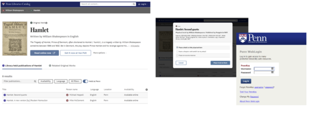
On Publication pages, the action button represents the most relevant action for the entity in question. It could be the redirect to the resource / record in the local OPAC of the library (this is a very typical case, where the OPAC link is extracted from the original MARC record of the library and associated to the action button); it could be the link to access an online version or request a physical copy of the title you are looking at.
The link and the text of the action button can be configured.
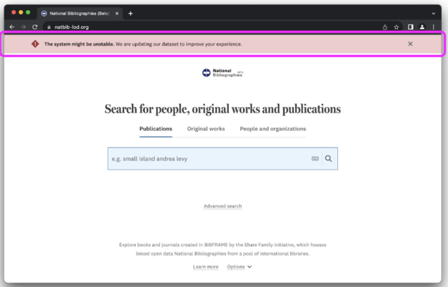
Notification banner
For situations where you need to urgently communicate to users, a realtime-updated system has been put in place, allowing you to add a message for users which will appear as soon as you have saved the text, and the users refresh or reload the page.
Institutional portal configuration
Branding and design
Name and subdomain
The institution referred to by the institutional portal can select the name and the subdomain of the portal, within the portal group main domain (eg. New York University Libraries is a member of Share-VDE in the https://svde.org portal group, and the NYU institutional portal is https://nyu.svde.org).
Add link to library website (optional)
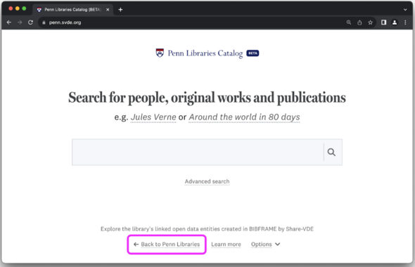
On the front-page of the portal a link to the main library website can be added; URL and label can be configured.
Institutional logo and brand colour (optional)
A logo and brand color matching the institutional brand can be used for the top bar on subpages, and (if enabled) for the ‘beta’ badge on the front page.
If your branding is multi-lingual, you can provide one set of logos per portal language.
Technical specifications for the logo will be provided.
If the portal is under development, it’s possible to enable the ‘beta badge’ feature.
Text content
Add footer links (optional)
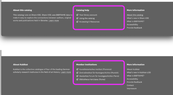
In the subpage footer, there is a section reserved for up to six portal specific links. This space can be used for links to help articles, opening hours and more relevant for a specific library portal; it may be utilized for listing out all the members of a given consortium represented in a portal, or something else.
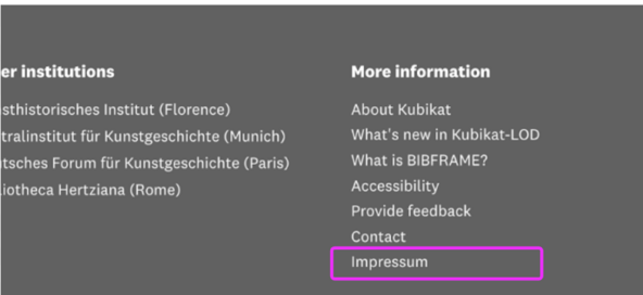
Add impressum link (optional)
In some cases, there may be a legal requirement to add a link to an ‘impressum’ page in the footer of the website. If such a link is provided, it will appear in the subpage footer of the portal.
Information pages
The default setting for informative pages is that of having the same pages as those in the portal group primary portal. However, to some extent informative pages can be configured to have specific information appearing only on the institutional portal.
Extended portal branding
Extended portal branding can be enabled for an individual institutional portal, and is relevant in cases where you need more individuality across portals than the standard setup provides. It allows you to override some of the centrally controlled portal-group defined properties with portal-specific ones.
Frontpage footer text
With extended portal branding, you can override the portal-group footer text on the frontpage, allowing you to write a unique frontpage footer text for a single portal, instead of a shared frontpage footer text used across all institutional portals in the portal group.
Subpage footer text
With extended portal branding, you can override the portal-group footer text for subpages, allowing you to write a unique footer text for a single portal, instead of a shared footer text shared across all institutional portals in the portal group.
Functionalities
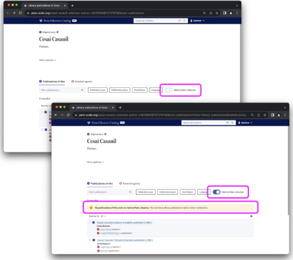
Enable ‘Held at’ toggle
For portals representing a particular holding location, like a specific library in a consortium or shared project, it may be relevant to enable the ‘held at’ toggle feature for a portal.
This feature makes a toggle appear in the filter section of any lists of publications, making it quick for users to get a list of locally held items, without losing the benefits of a shared-data system.
If some of the list items are locally held, toggling the switch on, will filter the list to show only locally held items. If no publications are available locally, a banner is shown to make it clear to users that the publications below are not locally held.
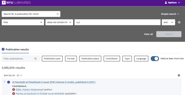
The toggle is also available in the advanced search page.
Integration with local services (optional)
Directly from the resource page in the discovery portal it’s possible to access to local library services through the integration of machine-to-machine protocols, eg. the connection to local library’s APIs for circulation services like Alma. The integration with local library’s services is optional and can be configured with ad hoc developments.
Language of the portal
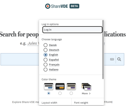
Languages of the interface that should be available for users can be configured. The language can be changed by users in the associated dropdown (see illustration).
At the time of writing, the following languages are available: English, Italian, French, German, Spanish, Norwegian, Danish. A default language for the portal must be chosen.
